| Page last updated
3 December 2016 |
Conservation Alignment
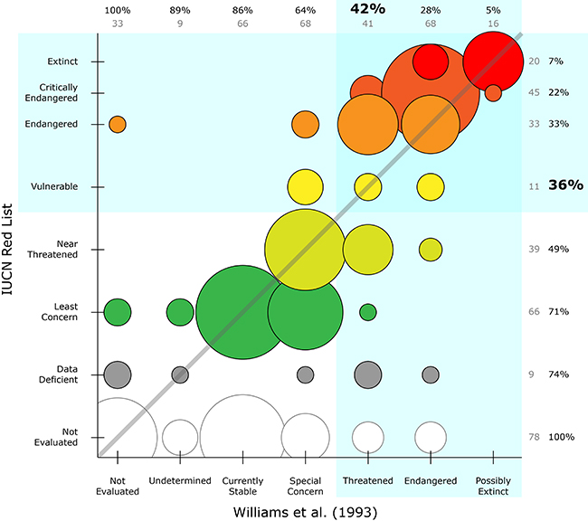
The following chart was created to accompany the December 2016 Mussel of the Month. It summarizes the species conservation assessments by Williams et al. (1993) and the IUCN Red List. The size of the circles is proportional to the number of species that fall into the ranks of each assessment, and the colors correspond to the IUCN status (and just class-up the whole thing). For all assessment ranks, the marginal totals of the number of species are provided, as are the cumulative percentages (beginning with the % extinct species and progressing through the rest of ranks). Circles above the diagonal reflect an escalation in conservation status (i.e., more threatened) from Williams et al. (1993) to the Red List, and those below indicate demotions.

To make this chart, we started with our current list of Nearctic species from the MUSSEL Project Database (less Sphenonaias taumilapana). That list was aligned with the species lists from Williams et al. (1993) and the IUCN Red List, which were already entered into the MUSSELpdb. Where a current valid species had more than one conservation assessment for either assessment dataset (because there were separate evaluations for multiple subspecies or previously valid species had been synonymized), the least threatened rank was applied.
Reference:
|